
Creating Infographics for Accessible Communication
Infographics are a common way to make the findings for a data exploration more accessible. CTData has created infographics for our nonprofit and state agency clients, as well as for our own work. Examples of the different kinds of infographics we have created are below. Click on this link to set up a consultation.
Informational Posters

Why: Shared information about various programs to raise awareness of our work.
Setting: In-person conference.
Challenges: Different teams had different kinds of information to present, and shared their information in a variety of graphic formats. We needed to create a cohesive look while ensuring people could see each poster represented a different program.
Design Idea: Established a cohesive look with a consistent header in brand colors and fonts. Added diversity by using unique footers, showcasing each team's individuality on every poster.
Infographic of Data Portal
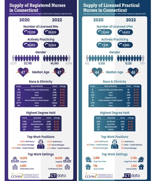
Why: Needed accessible infographics for the website summarizing extensive nursing data over the years.
Setting: On the website.
Challenges: The complexity of numerous datasets.
Design Idea: Analyzed all datasets, extracted key data points, and presented them through straightforward comparison infographics. Incorporated well-chosen shapes and icons for effective communication.
Organizational History

Why: Summarize the organization's history.
Setting: CTData’s About page of the website.
Challenges: Managed data overload, maintained clarity, and achieved visual appeal while ensuring chronological accuracy.
Design Idea: Employed a timeline layout for easy readability, integrated a Hartford image to highlight the organization's presence in Hartford, and used a legal size page to ensure accessibility for print.
Report Summary

Why: Summarize key findings from 2023 Elusive Equity Report.
Setting: Printed pdf.
Challenges: Numerous datasets.
Design Idea: Extracted key data points and summarized findings for clarity. Employed icons to convey categories, and utilized color contrasts to emphasize essential information.
Summarize Concepts

Why: Enhanced the landing page for a project with an engaging image.
Setting: Online.
Challenges: The client prefers an infographic to an image to represent Adverse and Positive Childhood Experiences.
Design Idea: Conveyed the fundamental concept of the project, adding visual interest to the landing page.
Infographic-Style Data Charts

Why: Enhanced a blog post with a compelling image.
Setting: Blog post.
Challenges: The information overload in a data analysis.
Design Idea: Highlighted intriguing findings to pique readers' interest and encouraged further exploration.
Social Media Images

Why: Enhanced a blog post with a captivating image.
Setting: Social media posts.
Challenges: Chose from many interesting data points in a data report, dashboard, or analysis.
Design Idea: Spotlighted compelling findings to grab readers' attention and enticed them to delve deeper into the details.
Interactive Infographic

Why: Drawn people in to read more of a blog post.
Setting: Blog post.
Challenges: Chose from many interesting data points.
Design Idea: Incorporated animated elements to captivate readers' attention and spark interest, encouraging further exploration.

Why: Inform the public about nursing data.
Setting: Social media.
Challenges: Chose from many interesting data points.
Design Idea: Utilized simplicity and high contrast to establish a focal point, highlighting the most essential element for maximum impact.