CTData's Revamped Covid-19 Dashboard
Covid-19. Pandemic. Stimulus payment. Unemployment. Reopening.
These are some of the phrases echoed throughout conversations with friends, family, colleagues, doctors, scientists, and government officials since March. Our knowledge regarding Covid-19 has evolved over the past five months, yet uncertainty continues to linger.
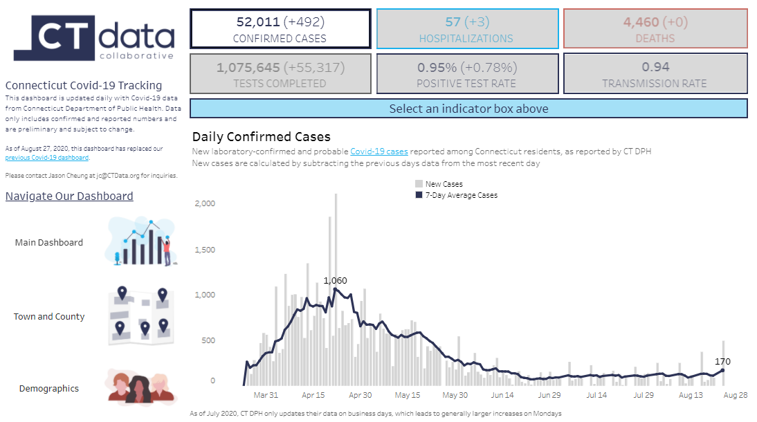
Data alone cannot completely eradicate uncertainty, but it can help us identify patterns and trends to gain a better understanding of the pandemic’s impact on our neighborhoods, state, and country. With analysis and daily updates of Connecticut’s Covid-19 data, CTData’s Covid-19 Dashboard integrates daily updates of Connecticut’s Covid-19 numbers with effective data visualizations for quick access to all of the information you need in one dashboard.
New Dashboard
Our new Covid-19 Dashboard is now live, updated with a cleaner interface and new visualizations. Keep reading to explore the updates we made to align the dashboard with evolving data needs as the pandemic continues.
Previous Dashboard
Raw data can be complex and messy. Our goal at CTData is to make data digestible, intelligible, and relevant for our users through visualizations and storytelling. In April, CTData analyzed Covid-19 data from the Connecticut Department of Public Health (CT DPH) to build the first version of our Covid-19 Dashboard, which provided a snapshot of Covid-19 in Connecticut.
This dashboard focused on cumulative data such as total tests completed, total confirmed cases, and total deaths, as well as demographic and economic data. These cumulative graphs allowed our users to easily visualize Connecticut’s progress in “flattening the curve” over the span of several months.
Updates and Changes
The visualizations in our previous dashboard were both important and relevant in the early months of the pandemic, and, while they remain important, they are becoming less relevant in today’s conversations. Here are several important updates and changes in our new dashboard:
Cases, Deaths, and Tests: show new daily changes to provide users with a better sense of day-to-day activity, including a seven-day average
Positive Test Rate: provides the percentage of daily Covid-19 tests reported as positive, including a seven-day average
Transmission Rate (Rt): represents the average number of people who become infected by an infectious person. Data is updated daily using estimates from the CT page on rt.live. We recommend reading the FAQ to learn more about Rₜ.
Town Data: broken down by cases, deaths, and tests, which provides more detailed information to inform decisions such as business and school reopenings
Other Changes:
Most metrics on the main dashboard now include an indicator displaying the increase or decrease from the previous business day. (CT DPH only updates their Covid-19 data on business days as of July 2020.)
Demographics dashboard now contains a filter to view data by age, race/ethnicity, and gender
Questions and Comments?
The new Covid-19 Dashboard was built largely with our users’ recommendations and comments in mind. Please contact Data Analyst Jason Cheung at jc@CTData.org with any questions, comments, or suggestions about our new dashboard.
If you’re interested to learn more about Covid-19 data, check out our website and part one and two of our COVIDeracy blog posts. For training and tips on how to use data to inform your personal and professional life, register for one of our CTData Academy workshops or browse our blog. You can keep up with all of our updates by subscribing to our newsletter and following us on Twitter, Facebook, and LinkedIn.